We were given a number of film posters to analyse so we could get an idea of what they are like for when we have to create one for our short film - if we choose to.
The Dark Knight

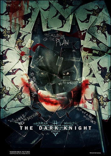
The first two we were given were for the film "The Dark Knight".
Both of the posters have sinister themes to them, especially when compared to other superhero films such as Superman and Spiderman. These 2 posters could almost be advertising a horror movie.
The poster on the left actually features the Batman character, even though he is made up of joker cards, which excentuates the importance of the Joker character. Phrases and quotes from the Joker are etched into the cards, and the logo itself is actually formed by the word "HA" scratched over and over again in the shape of the logo.
The red mouth on the left poster looks as though it is blood and the scalpel was used to cut his mouth.
The fact that there are little-to-no credits on the poster means that the audience has to do their own research into it as they may not know who the actors starring in it are going to be, and it also leaves a lot tho the imagination, in that it really doesn't give much away about the film other than it's about Batman and the Joker.
The red mouth is iconic for the Joker in the film so to have it as the main feature on each poster really emphasises the importance of the Joker throughout the film. As well as the mouth, there is also the quotes from the film by the Joker ("Why so serious?") which also helps to show off how big of a role the Joker plays in the film. The actor playing the Joker (Heath Ledger) died before the film was released, this could be the reason that the Joker and his mouth is the main focus of both posters in order to bring in fans of the actor.
The overall simplicity of the posters emphasises the mystery of the film and keeps details to itself, much like the main character Batman. He is a very mysterious character, staying within the shadows and never revealing himself.
Forrest Gump
 This Forrest Gump poster that we looked at was a lot different than the Dark Knight ones we looked at. For a start, the poster is covered in credits from actors to director and producers. In fact the main actor, Tom Hank's name is almost as large as that of the film title. This is so viewers of the poster can see who is starring in the film, rather than being left to guess like The Dark Knight. However Forrest Gump was a one-of-a-kind film whereas The Dark Knight was a sequel of Batman Begins in which Christian Bale plays Batman so the audience may presume that Bale would be playing him again.
By having Tom Hank's name so large can draw in audiences as he is widely reknowned for starring in good films such as Big, Sleepless In Seattle and Philidelphia. In fact, Hanks had won an Academy Award for Best Actor the year before Forrest Gump was released for his role in Philidelphia.
Like the Dark Knight posters, the Forrest Gump poster is also very simplistic. This very much reflects the main character who himself is a very simple person. He goes all over the world throughout his life, becoming a catalyst for many iconic moments but not even realising it, and only wanting to find the girl he loves.
By having him sitting on a bench with a suitcase with no other indication of where he is can make the audience think about where he may be heading, what he might be doing and may entice them to go to the cinema to watch the film and find out.
Cloverfield Poster

The tagline "Some Thing has found us." emphasises that it is a creature that has attacked the city and not humans. This is done by having something split in 2 as some thing, saying that it is a thing that is attacking New York, yet keeping it a mystery as to what this creature is.
Even the movie title doesn't give anything away about what the film is about. People wouldn't be able to search the internet and find out what a cloverfield is as there is no set definition on it. It was created solely for the film and is actually the name given to the file of the incident by the US Department of Defence. So again, the title on the poster doesn't give anything away about the film.
The fact that such an iconic landmark like the Statue of Liberty has lost its head holds significance in the poster. The Statue itself represents freedom, so to have the head of it knocked off presents a message that the citizens of America that they are not free.
The poster doesn't contain many credits, and of them there isn't any actors or actresses credited as no one extremely famous was cast. The most recognised member of the cast was probably the girl that no one knows the name of, but instead refers to her as "the girl who's Janice in Mean Girls". (This was how I personally remembered her.)
Out of all of the film posters that we looked at, I would say that the Dark Knight ones were the most effective. This is because I personally found them the most "grabbing", my particular favourite being the one shown on the right. This is because it is simple, but effective and really made me want to watch the movie.
Out of all of the film posters that we looked at, I would say that the Dark Knight ones were the most effective. This is because I personally found them the most "grabbing", my particular favourite being the one shown on the right. This is because it is simple, but effective and really made me want to watch the movie.
No comments:
Post a Comment