- Santa Claus - A mockumentary about Santa's life now that the world hates him after he did something (undetermined) wrong. He has become a bit of a drunk, he doesn't care about his looks anymore, etc. It would follow him in his day-to-day life, coming over confrontations with his haters.
- Grammatical OCD - This idea came to me when I was talking to a friend and I had to correct them on their grammar. The mockumentary would follow the life of someone suffering with ocd, who feels the need to correct everyone who is grammatically incorrect.
- Wildlife Documentor - I was watching a wildlife documentary with David Attenborough and thought that I could do a mockumentary about a boy who is convinced he's David Attenborough and documents everything he sees as though he were in fact David Attenborough.
Saturday, 22 October 2011
Ideas for Short Film
I have my heart set on doing a mockumentary as I really like the style that they are shown in. I've had a few ideas which I feel could be successful as mockumentaries.

Tuesday, 18 October 2011
Who Reads Film Reviews?
Film reviews can be aimed at anyone, but it primarily depends on what is reviewed and where its reviewed that effects the target audience.
For example, a film review for Sex & the City in Heat magazine is likely to be for women who are looking to have a girls' night out with their friends. However a review for a film like We Need To Talk About Kevin in the BFI Sight & Sound magazine is most likely to be for film enthusiastes looking for a thrilling film to watch.
However, this is not to say that Sex & the City fans can't read its reviews in the BFI magazine, and that film enthusiates can't read the reviews in Heat magazine, it's just that the consumer for each of the products are more likely to read particular reviews.
It's because of this that film critics need to make sure they know who they are writing their reviews for. If a non-descript review is written for an art-house film, it's not likely to get read and if a chick flick has a long detailed review, then the review is less likely to be read.
For example, a film review for Sex & the City in Heat magazine is likely to be for women who are looking to have a girls' night out with their friends. However a review for a film like We Need To Talk About Kevin in the BFI Sight & Sound magazine is most likely to be for film enthusiastes looking for a thrilling film to watch.
However, this is not to say that Sex & the City fans can't read its reviews in the BFI magazine, and that film enthusiates can't read the reviews in Heat magazine, it's just that the consumer for each of the products are more likely to read particular reviews.
It's because of this that film critics need to make sure they know who they are writing their reviews for. If a non-descript review is written for an art-house film, it's not likely to get read and if a chick flick has a long detailed review, then the review is less likely to be read.
Saturday, 15 October 2011
Successful Poster Campaigns
With so much riding on a film’s success, marketing one is a massive opportunity for creative designers. Posters are one of the main (and most traditional) means of marketing a film. However, to be truly successful the poster must follow some simple guidelines:

It contains; the director, the date of release, movie title, etc, just like the majority of film posters around. However the marketing team created a different way to advertise the film that really stuck with me. The marketing team used signs-like posters in order to capture the audiences attention.
By using images that were easily related to those signs around our own towns/cities it could make peoples' heads turn to see what the "signs" were warning them about.
The marketing campaign released 3 different types of posters for the film, all of which could easily pass as billboard images, etc. They are shown below.


It grabs people's attention as it talks about discrimination, an on-going matter in the world, about a race unlike ourselves. The only way people can find out about the information on the signs is with the website and the telephone number which leads the caller to a hotline about non-humans escaping district 9 and could be violent and unpredictable.
- Film posters need to iconic and attention grabbing. That way they draw audiences in by using main characters or major plot points on the posters.
- It is also important to make sure that you do not give too much away in the poster, only giving the audience a glimpse at what the film is about without letting the know everything.
- The poster needs to make the sudience interested and to have a desire to see the film. This can be done by having an image that makes the viewer feel as if they are there and that they need to see the film in order to resolve the problem.
- The poster needs to be consistant with the film itself. By having a poster with dark colours, tones and blood everywhere when it's promoting a children's animation is a very poor marketing campaign as it will only scare children off instead of drawing them in.
- For film posters to work for the long-term, they need to be scalable, clear, and have lasting design appeal.
- They MUST be recognizable. That way people will be able to spot it and immediately know what it is promoting. As well as this, it means that if a sequel was to be created, then by keeping the design similar the 2 posters can be related.
One marketing campaign that I have come across is one for the film District 9. It was very different to other campaigns I've seen, using very clear references to our history, regarding race-based rights restrictions.
Below is the generic film poster for the movie.

By using images that were easily related to those signs around our own towns/cities it could make peoples' heads turn to see what the "signs" were warning them about.
The marketing campaign released 3 different types of posters for the film, all of which could easily pass as billboard images, etc. They are shown below.
Bus Stop Poster


Bench Poster
Billboard Poster

All 3 posters say pretty much the same thing, just in a slightly different format. To anyone viewing them, they would initially be nothing more than a warning. Unlike the conventional movie posters about, they give very little away about the film, what its name is, who's in it, etc. The only ting people can relate it to "District 9" with, is the silhouette of the alien and the website (D-9.com) which is a constant featured on all 3 posters.
It grabs people's attention as it talks about discrimination, an on-going matter in the world, about a race unlike ourselves. The only way people can find out about the information on the signs is with the website and the telephone number which leads the caller to a hotline about non-humans escaping district 9 and could be violent and unpredictable.
This is an excellent way of keeping the overall suspense of the film and what it's entirely about. The phone call also leads the caller to the D-9.com website, a place where the trailer was likely to have been.
Different Styles of Magazine
Magazines come in all sorts of styles and formats and their contents change in formality because of it. For example, magazines such as Heat and OK are ver informal in particular when reviewing films. However magazines such as BFI Sight & Sound that are aimed at the film industry provide much more detailed reviews for movies.
 These sorts of magazines can also be found all over the interenet, whether they are printed or not there are copius amounts of website aimed purely at reviewing films. Examples of these sites are Total Film and Rotten Tomatoes. The reviews for the films that they provide a decent overview of the film and what audience members and critics alike thought of it. Everyone's opinion is shown on the review, whereas reviews in magazines such as OK are much less formal, using phrases and words like "Hurrah!". This is probably due to the fact that OK does not specialise in film reviews like Rotten Tomatoes, it is more of a celebrity gossip magazine.
 The BFI Sight & Sound magazine is very different to OK magazine. For starters, the reviews are about 5 times as long as those from OK magazine. The magazine says it reviews all films released each month, including those with a narrow art-house release, as opposed to the more mainstream focus of magazines like OK. Sight & Sound also features a full credit list of cast and crew for each film reviewed.
Friday, 14 October 2011
Effects of Film Reviews
Critics play a significant role in consumers’ decisions in many industries, in particular the film industry. Film-goers use reviews to help them determine whether certain films a worth watching.
The effects of film reviews on box office and DVD sales are very much split. For instance, the reviews of films found in newspapers, magazines or online on websites such as Rotten Tomatoes can have a direct effect on whether or not audiences choose to view the film. If a trustworthy source tells its readers that a film is awful, it is extremely likely that less people will go to see it, and vise-versa. If a film has an excellent review, people may be more enclined to go and see it.
The problem is that with the ever growing number of "trashy" magazines being published contain their own film reviews section. It's these that are writing small, undetailed and essentially untrustworthy reviews for films, but some people trust them all the same as they would a review in a magazine such as BFI Sight & Sound.
Tuesday, 11 October 2011
Common Conventions of Film Posters
Film posters are a vital aspect for the promotion of any film during the marketing process. They attract an audience as they are a major form of visual communication and are of interest to many people of all ages.
The main forms and conventions of film posters include:
The way in which the poster is constructed and what it consists of are very important for the representation of the film featured. For example if the poster was promoting a horror film but the font used for the title was smooth and elegant, than the film is likely to be percieved incorrectly by an audience.


However the posters for other genres of film, such as comedy tend to be much brighter, with much more colour and focus more on the main characters - very much the opposite of horror movies.
An example of this is shown on the right. It is the poster for the film "Year One" starring Jack Black and Michael Cera, 2 actors known for their comedic films.
The poster is much more colourful than that of the Saw VI one, immediately giving the impression to the audience that the film is pretty light-hearted and happy.
The main forms and conventions of film posters include:
- A large, bold title to attract the eye and ensure the audience will be aware of the name of the film.
- Contrasting colours so that all the colours of the poster are clearly visible.
- Usually only one predominant image is used to promote the film.
- The names of the actors/actresses playing the main characters also help to promote the film as the appearance of popular (Well known actors and actresses encourage fans to go and see the film).
The way in which the poster is constructed and what it consists of are very important for the representation of the film featured. For example if the poster was promoting a horror film but the font used for the title was smooth and elegant, than the film is likely to be percieved incorrectly by an audience.
The colours used on the poster can also affect the impression given to an audience about the film, for example it is unlikely that pastel colours such as light pink and purple tones would be used for a horror film poster as pink represents love and beauty whilst purple symbolizes royalty and magic.
Below on the left is an example that I found of a horror film poster. It is the poster for "Saw IV".

It fits with the generic horror movie poster, with dark colours and reasonably sharp fonts.

However the posters for other genres of film, such as comedy tend to be much brighter, with much more colour and focus more on the main characters - very much the opposite of horror movies.
An example of this is shown on the right. It is the poster for the film "Year One" starring Jack Black and Michael Cera, 2 actors known for their comedic films.
The poster is much more colourful than that of the Saw VI one, immediately giving the impression to the audience that the film is pretty light-hearted and happy.
Sunday, 9 October 2011
Editing Styles
Film editing is part of the creative post-production process of filmmaking. It involves putting shots together to create a storyline. There tends to be at least 3 cuts; the Editor's Cut, the Director's Cut and then the Final Cut.
A major problem with editing is continuity. When the series of shots isn't physically continuous, this is when there is a continuity error. This could be due to a slight change between camera angles. For example, if in one shot the milkshake glass is full and in the next the glass is missing some milkshake, even though no character has drunk any.
I found this really useful video on vimeo, made by a couple of guys simply telling viewers what not to do when making a film.
What Not To Do When Making A Film from Jhotch59 on Vimeo.
A major problem with editing is continuity. When the series of shots isn't physically continuous, this is when there is a continuity error. This could be due to a slight change between camera angles. For example, if in one shot the milkshake glass is full and in the next the glass is missing some milkshake, even though no character has drunk any.
I found this really useful video on vimeo, made by a couple of guys simply telling viewers what not to do when making a film.
If I follow these pointers, it will make my short film look much more professional.
Film Posters in Popular Culture
Nowadays, the way film posters are displayed has changed. Items of clothing (primarily T-shirts) are able to have all sorts printed onto them, including film posters. For example, the images below are of the film poster for "Indiana Jones: Raiders of the Lost Ark", both the original and when applied to a t-shirt.


This essentially allows for the poster to be displayed whenever someone wears it, promoting the film even more.
As well as t-shirts, people are able to by posters to put up in and around their homes. Copies of those found at cinemas are popular to have up on walls in bedrooms, on doors, etc.
Saturday, 8 October 2011
What influence do film posters have?
A movie poster is used to advertise a film, often there are several variations of the posters displayed around. These images are shown all over cinemas (inside and out) down streets, at busstops, in magazines, etc.
The generic film poster includes text, a picture of the main character/s, the release date and some sort of tagline. There is likely to also be production crew credits - but only the main ones.
Despite being works of advertising art, movie posters don't seem to be a prevelent as they used to be. This may be due to all of the available information on the internet, allowing people to have access to videos, trailers and articles on the films. Doing some research into film posters, I have discovered that there are 2 main types of poster; Old and New.
 The older posters have much more information on them. For example, the film poster for "Gone With The Wind" there is a lot of text, with reference to the soundtrack and all of the minor characters featured in the film.
This is because when the film was created in 1939, film poster were very much all that movies had for advertisement. There were no trailers and the names featured on the posters were the main attraction for audiences as big names drew people in. This is why the main characters' faces take up 50% of the poster.
 However, in more modern films, the posters do not contain nearly as much information. The majority include the basics; name, release date, main actor, etc. These are just as, if not more, effective than the older posters. They are much more minimilistic, making the poster look neater and they draw an audience in by not giving much away, encouraging people to go away and research it. This is do-able with resources such as the internet.
My example for a new poster is from "X-men Origins: Wolverine". It is extremely minimilistic, only showing a photo of the main character and its release date. The lack of actors, movie title, etc is due to the fact that this film is part of a series. It is the fourth out of all the X-men films, so this character has already been featured in 3 other films.
The majority of people are likely to know that Hugh Jackman is the actor who plays the wolverine character, who is renowned for his metal claws, therefore by having the claws as the main focus of the poster, people should immediatly think - oh, that's Wolverine.
Therfore, I feel that for this time and age, using less text and more images would make my poster more effective as it would have a much more modern feel to it.
The generic film poster includes text, a picture of the main character/s, the release date and some sort of tagline. There is likely to also be production crew credits - but only the main ones.
Despite being works of advertising art, movie posters don't seem to be a prevelent as they used to be. This may be due to all of the available information on the internet, allowing people to have access to videos, trailers and articles on the films. Doing some research into film posters, I have discovered that there are 2 main types of poster; Old and New.

This is because when the film was created in 1939, film poster were very much all that movies had for advertisement. There were no trailers and the names featured on the posters were the main attraction for audiences as big names drew people in. This is why the main characters' faces take up 50% of the poster.

My example for a new poster is from "X-men Origins: Wolverine". It is extremely minimilistic, only showing a photo of the main character and its release date. The lack of actors, movie title, etc is due to the fact that this film is part of a series. It is the fourth out of all the X-men films, so this character has already been featured in 3 other films.
The majority of people are likely to know that Hugh Jackman is the actor who plays the wolverine character, who is renowned for his metal claws, therefore by having the claws as the main focus of the poster, people should immediatly think - oh, that's Wolverine.
Therfore, I feel that for this time and age, using less text and more images would make my poster more effective as it would have a much more modern feel to it.
Friday, 7 October 2011
Framing the Shot & Camera Angles
To most, the type of angle or shot is used to make things more noticable or make them look better, but there is so much more to shots and angles than that. As stated in the video, high angle shots create a vulnerability of the character, whereas low angle shots create a looming effect and make things seem larger than they actually are.
It's things like this that need to be taken into consideration when creating a short film.
Vanilla Sky - Times Square Scene from Paul Gruber on Vimeo.
This video is a scene from "Vanilla Sky". It uses low-angle shots to show how tall the buildings are compared to Tom Cruises's character.
This video is a scene from "Vanilla Sky". It uses low-angle shots to show how tall the buildings are compared to Tom Cruises's character.
Wednesday, 5 October 2011
Use of Sound
The use of sound in film doesn't necessarily mean just the soundtrack used, it also covers aspects such as; spoken word, music, sound effects or even silence. A film does not have to contain all of these aspects to be successful, it can contain just one and be a great film it's all down to how effective the sound is used.
Spoken Word
The use of spoken word in film covers; dialogue, monologues or even narration. This also means that it's not just what is said, but also how it is said. For example, dialogue that is overlapping can be used to create stress or a sense of nervousness.
Another example of how sound can be used in dialogue is by having it distorted for effect, one of the most famous is that of Darth Vader and this can reveal a lot about a character, or could draw in viewers to find out why they talk like that.
Films rely heavily on visual aspects to convey a lot of expressions to the audience, but the use of spoken dialogue can be extremely expressive. Below is a video of a scene primarily relying on dialogue to convey the story and emotions (with the exception of quiet background music at the end).
Sound Effects
The use of sound effects in film consists of; the sounds that the objects make, the sounds that the characters make (other than dialogue) and background/ambient noises. They help to create a sense of location, intensify a mood, enhance a humorous situation, or conceal an action.
Sound effects specialists have many options in manipulating sounds, such as playing them backward, playing them faster or slower than they were recorded, constructing them, and blending them in different proportions.
The actual sound effect used does not necessarily have to be exactly what it is meant for the film. For example, in Star Wars the laser guns are something we don't have and can therefore not record its sound for the movie. Instead simple objects can be used to create a fitting sound for the film. This is shown in the video below.
Music
Celine Dion - My heart will go on from Videoteca on Vimeo.
Spoken Word
The use of spoken word in film covers; dialogue, monologues or even narration. This also means that it's not just what is said, but also how it is said. For example, dialogue that is overlapping can be used to create stress or a sense of nervousness.
Another example of how sound can be used in dialogue is by having it distorted for effect, one of the most famous is that of Darth Vader and this can reveal a lot about a character, or could draw in viewers to find out why they talk like that.
Films rely heavily on visual aspects to convey a lot of expressions to the audience, but the use of spoken dialogue can be extremely expressive. Below is a video of a scene primarily relying on dialogue to convey the story and emotions (with the exception of quiet background music at the end).
Sound Effects
The use of sound effects in film consists of; the sounds that the objects make, the sounds that the characters make (other than dialogue) and background/ambient noises. They help to create a sense of location, intensify a mood, enhance a humorous situation, or conceal an action.
Sound effects specialists have many options in manipulating sounds, such as playing them backward, playing them faster or slower than they were recorded, constructing them, and blending them in different proportions.
The actual sound effect used does not necessarily have to be exactly what it is meant for the film. For example, in Star Wars the laser guns are something we don't have and can therefore not record its sound for the movie. Instead simple objects can be used to create a fitting sound for the film. This is shown in the video below.
- Film music may serve countless functions, for example it can mirror a film’s central conflict, direct viewers’ attention, establish place and time, suggest what a character feels like and can even cover weak acting.
- Film music may reference earlier film music. Sometimes the same music is used; other times an approximation is composed and used.
- In large-budget movies, sometimes the film music is selected with an eye to future recorded music sales. An example of this is Celine Dion's "My Heart Will Go On" from the Oscar winning "Titanic". It is Dion's biggest hit and one of the best-selling singles of all time. Below is the official music video for the song.
Celine Dion - My heart will go on from Videoteca on Vimeo.
Tuesday, 4 October 2011
Use of Narration
A narrator may tell the story from his own point of view (as a fictive entity) or from the point of view of one of the characters in the story. The act or process of telling the particulars of a story is referred to as narration.
One film in particular that I can think of which includes a narrator is Stranger Than Fiction in which the main character's life is narrator by the woman who is writing a story that turns out to be his exact life. The story line was rather intelligent and very original, nothing like I've watched before. Below is a video clip from the film, showing some of the narration.
MK12 // Stranger Than Fiction: Opening from MK12 on Vimeo.
I like the idea of having narration in my short film, which is why I am further inclined to create a mockumentary as a large number of them have some sort of voice-over rather than a narration of the story.
One film in particular that I can think of which includes a narrator is Stranger Than Fiction in which the main character's life is narrator by the woman who is writing a story that turns out to be his exact life. The story line was rather intelligent and very original, nothing like I've watched before. Below is a video clip from the film, showing some of the narration.
MK12 // Stranger Than Fiction: Opening from MK12 on Vimeo.
I like the idea of having narration in my short film, which is why I am further inclined to create a mockumentary as a large number of them have some sort of voice-over rather than a narration of the story.
Monday, 3 October 2011
Research into "Mockumentaries"
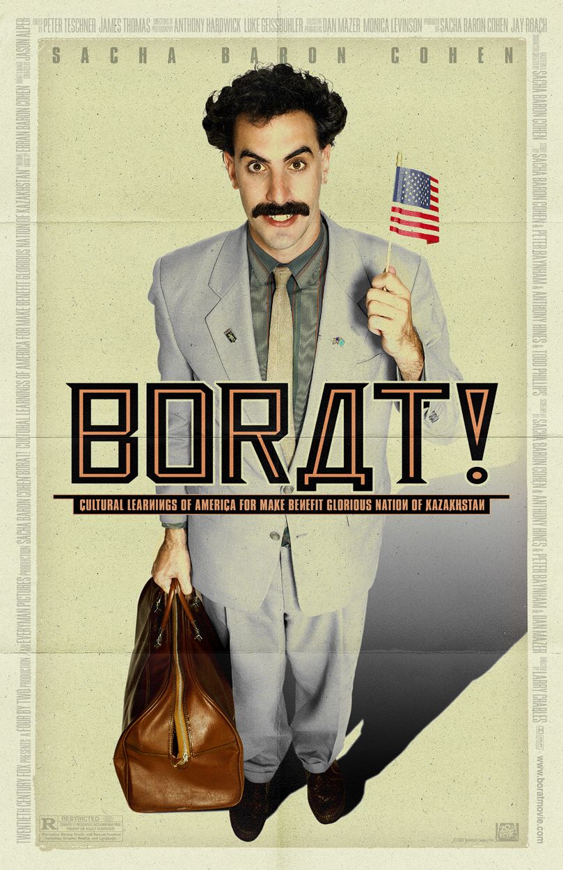 A Mockumentary is a film/programme in which fictitious events are presented in a documentary format. They are often either comic or dramtic form, however comic mockumentaries are more prevalent.
Of our generation, one of the most famous mockumentaries is Sacha Baron Cohen's Borat: Cultural Learnings of America for Make Benefit Glorious Nation of Kazakhstan. This film follows Borat Sagdiyev, a TV personality to USA to create a documentary film. It had very mixed reactions, however it proved popular due to its extreme silliness. This was a feature-length film and was released in cinemas.
On the television, there are programmes that are similarly mockumentaries. For example, the most popular ones on British TVinclude The Office and Little Britain. They follow the day-to-day lives of certain characters.

Below is a clip from the show Summer Heights High where the audience is introduced to the character Jonah.
Introducing Jonah
One of my favourite mockumentaries that I came across when research for Short Mockumentaries was that of the video below. It's called The Majestic Plastic Bag and it's a mock wildlife documentary, following the life a plastic bag. It's not unti lthe very end that it is revealed that it's actually a video trying to raise awareness in rubbish in the Pacific Ocean. I think it's an extremely well done short film, and I thoroughly enjoyed watching it.
One of my favourite mockumentaries that I came across when research for Short Mockumentaries was that of the video below. It's called The Majestic Plastic Bag and it's a mock wildlife documentary, following the life a plastic bag. It's not unti lthe very end that it is revealed that it's actually a video trying to raise awareness in rubbish in the Pacific Ocean. I think it's an extremely well done short film, and I thoroughly enjoyed watching it.
Another short mockumentary that I came across was the one below called Parking Patrol. It's about a girl who spends her time putting comment cards on people's badly parked vehicles in an attempt to make them park better next time. I like the idea of this, it's simple and an actual problem that viewers can relate to.
Parking Patrol - A Mini-Mockumentary from Liz Brownback on Vimeo.
Sunday, 2 October 2011
Research into Stop Motion Animation
There are a lot of short films posted on the internet, and some of them are stop motion pictures.
It takes a long time to actually produce these kind of films and I think that is why a lot of stop motion animation films are short films. Movies such as Wallace & Gromit: The Curse of the Were-Rabbit took 5 years to make as it takes so long to complete.
Whilst browsing the internet, I came across some really well done stop motion shorts.
This one is only 40 seconds long, but I thought it was a really good, original idea.
POST-IT-UP from Amir Porat on Vimeo.
One of my favourite stop motion videos that I came across is this one below.
(To see it full screen, right click and select "full screen").
I really like how simple the idea is, just using an everyday household item like a post-it note and creating it into a video that is extremely enjoyable to watch.
Another video that I came across of an animation centred around a seemingly boring abject, but again was really good. However, this is also only about 40 seconds long, whereas my production has to be about 4 minutes long. The video is below.
Bumble Bee boy from Patrick Boivin on Vimeo.
Another video by the same creator that uses toys is shown below again.
Iron Man vs Bruce Lee from Patrick Boivin on Vimeo.
If I were to do a stop motion for my final production, I'd like to incorporate everyday items rather than create plasticine models. I would need to come up with some sort of storyline that could last me about 4 minutes, and many of the ones I watched during my research were very short. Whilst they are very entertaining, they are simply not long enough for this project in particular.
I feel that the length of my film would provide a problem if I were to do a stop motion animation that was good enough to grab the audience and keep them interested throughout.
It takes a long time to actually produce these kind of films and I think that is why a lot of stop motion animation films are short films. Movies such as Wallace & Gromit: The Curse of the Were-Rabbit took 5 years to make as it takes so long to complete.
Whilst browsing the internet, I came across some really well done stop motion shorts.
This one is only 40 seconds long, but I thought it was a really good, original idea.
POST-IT-UP from Amir Porat on Vimeo.
One of my favourite stop motion videos that I came across is this one below.
(To see it full screen, right click and select "full screen").
I really like how simple the idea is, just using an everyday household item like a post-it note and creating it into a video that is extremely enjoyable to watch.
Another video that I came across of an animation centred around a seemingly boring abject, but again was really good. However, this is also only about 40 seconds long, whereas my production has to be about 4 minutes long. The video is below.
Bumble Bee boy from Patrick Boivin on Vimeo.
Another video by the same creator that uses toys is shown below again.
Iron Man vs Bruce Lee from Patrick Boivin on Vimeo.
If I were to do a stop motion for my final production, I'd like to incorporate everyday items rather than create plasticine models. I would need to come up with some sort of storyline that could last me about 4 minutes, and many of the ones I watched during my research were very short. Whilst they are very entertaining, they are simply not long enough for this project in particular.
I feel that the length of my film would provide a problem if I were to do a stop motion animation that was good enough to grab the audience and keep them interested throughout.
Subscribe to:
Posts (Atom)